
Overview
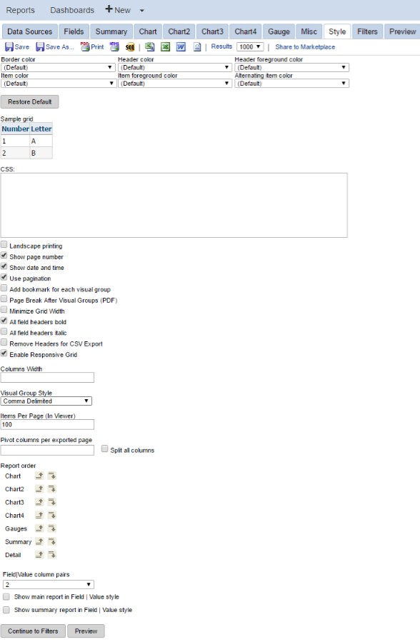
The Style tab is where you can customize the look and feel of your report. You can change the color of the border, header, and rows, as well as the order of the report items. This section goes over the controls in detail and how you can use them to maximize the effectiveness of your reports.
To locate this screen navigate to System > Report Writer.
Field Descriptions
Style Properties
There are six separate controls that you can use to select the colors used for various elements on your report. You can see the results of your changes in the sample grid that is displayed directly below the drop-down menus.
Border color, Header color, Header foreground color, Item color, Item foreground color, and Alternating item color can be adjusted. The tables below outline the features that can be adjusted.
<table data-table-width="760" data-layout="default" ac:local-id="2386d812-c56d-4a49-ac23-5e710dccce2f"><colgroup><col style="width: 340.0px;"><col style="width: 340.0px;"></colgroup><tbody><tr><td><p>Border Color</p></td><td><p>Affects the color of the border surrounding your grid cells</p></td></tr><tr><td><p></p><p>Header Color</p></td><td><p>Affects the background color of the report header columns. If you use visual grouping, this affects all header columns in each visual group.</p></td></tr><tr><td><p></p><p>Header Foreground Color</p></td><td><p>Affects the text color of every header column in your report.</p></td></tr><tr><td><p></p><p>Item Color</p></td><td><p>Affects the background color of the odd-numbered report items.</p></td></tr><tr><td><p>Item Foreground Color</p></td><td><p>Affects the text color of all report items.</p></td></tr><tr><td><p></p><p>Alternating Item Color</p></td><td><p>Affects the background color of the even-numbered report items.</p></td></tr><tr><td><p></p><p>Restore Default</p></td><td><p>Reverts all of the previously mentioned controls' settings back to their defaults.</p></td></tr></tbody></table>CSS and Printing Controls
These controls will allow you to control the style of your reports on a granular scale if need be and also to apply various visual elements to printed reports.
<table data-table-width="760" data-layout="default" ac:local-id="1f290415-3b7d-41ed-b8b7-4ec13634e179"><colgroup><col style="width: 340.0px;"><col style="width: 340.0px;"></colgroup><tbody><tr><td><p></p><p></p><p>CSS</p></td><td><p>You can define custom CSS to be used on this report inside the text box. You can use the browser object inspector to discern CSS class names used on the grid so you can override them.</p></td></tr><tr><td><p></p><p>Landscape printing</p></td><td><p>When selected, this will cause reports printed from the report viewer to be printed in landscape mode. Otherwise, they will be printed in portrait mode.</p></td></tr><tr><td><p></p><p>Show page number</p></td><td><p>When selected, this will display the page number on all page-dependent printed reports in XLS exports. This will not apply to the report viewer or to XML and CSV exports.</p></td></tr><tr><td><p></p><p>Show date and time</p></td><td><p>When selected, this will display the date and time on all page-dependent printed reports in XLS exports. This will not apply to the report viewer or to XML and CSV exports.</p></td></tr><tr><td><p>Use pagination</p></td><td><p>Sets whether the report viewer will use paging.</p></td></tr><tr><td><p></p><p>Add bookmark for each visual group</p></td><td><p>Sets whether bookmarks will be used on each visual group. Applies only to PDF exports.</p></td></tr><tr><td><p></p><p>Page Break After Visual Groups (PDF)</p></td><td><p>Sets whether each visual group will receive its own page when exported. This will not apply to XML, XLS, or CSV exports.</p></td></tr></tbody></table> <table data-table-width="760" data-layout="default" ac:local-id="73691f5f-4c44-4394-a7fe-047fd5f25c28"><colgroup><col style="width: 340.0px;"><col style="width: 340.0px;"></colgroup><tbody><tr><td><p>Minimize Grid Width</p></td><td><p>Select this check box to minimize grid width.</p></td></tr><tr><td><p>All field headers bold</p></td><td><p>Select this check box to make all field headers bold.</p></td></tr><tr><td><p>All field headers italic</p></td><td><p>Select this check box to make all field headers italic.</p></td></tr><tr><td><p></p><p>Remove Headers for CSV Export</p></td><td><p>Select this check box to remove field headers from the CSV export.</p></td></tr><tr><td><p></p><p></p><p></p><p>Enable Responsive Grid</p></td><td><p>Responsive Grid is a feature that re-sizes and re-positions report parts with respect to the current browser width.</p><p>When the width of the fields added to a report exceeds the width of the window, fields are removed from the horizontal header and added to an expandable section indicated by a "+". Charts will also be moved and re-sized.</p></td></tr><tr><td><p>Columns Width</p></td><td><p>Set the column width for all columns on a report.</p></td></tr><tr><td><p></p><p>Pivot Columns per exported page</p></td><td><p>When a pivot is used and the report is exported, this field will specify the number of columns to appear on a page.</p></td></tr><tr><td><p></p><p>Split all columns</p></td><td><p>Select to separate each pivot column onto its own page when a pivot is used.</p></td></tr></tbody></table>CSS Examples
As noted in the table above, you can enter custom CSS classes in the CSS text field from the Style tab to modify the look of many elements of your report. This CSS will override the stylesheets that normally control the look of the reports for the specific report you are working on. It is recommended that the resource you assign to this task has some experience with web design or development. We also recommend that you open the Report Writer in the browser version of ConnectWise® Manage™ while writing custom CSS. This will allow you to use your browser's developer tools to identify CSS class names and document structure. The example below walks you through the steps of changing the design of a report using custom CSS on the Style tab.
-
Open Manage in an internet browser like Google Chrome, Mozilla Firefox, or Microsoft Internet Explorer, then open the report you wish to modify and open the Report Designer.
- Click into the Preview tab.
-
Hover your mouse over the piece of your report you wish to modify. In this example, we will modify the "Open Ticket Metrics" header shown in the image below.
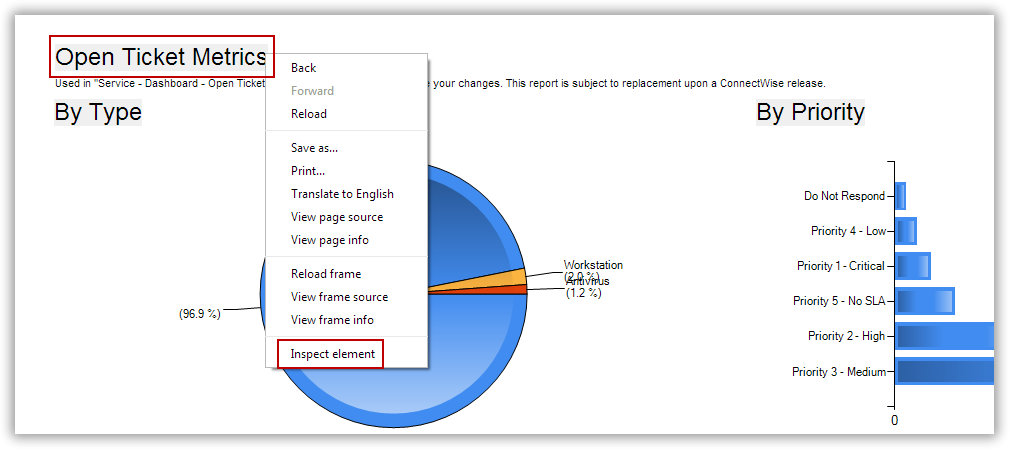
Right-click the piece of your report you want to modify (in this example, the "Open Ticket Metrics" header), then click Inspect Element. Alternatively, you can manually open the developer console or plugin tool of your choice, then locate the element you wish to modify in the HTML code.
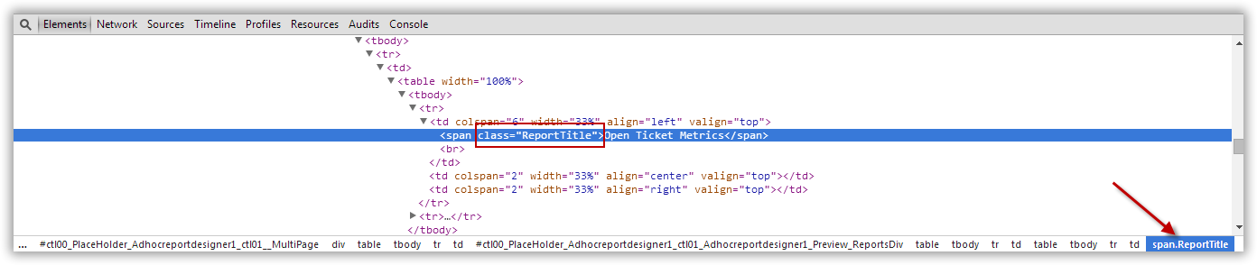
Click the image above for a full screen view. As you can see in the code, the name of the CSS class that controls the appearance of the header is "ReportTitle." This is also indicated in the lower right corner of the console.
-
Now that we know the name of the class that controls the header, we can write our own custom class. Click back into the Style tab.
-
Write a custom style in the CSS field in the Style tab. In this case, we want our header to be red to call special attention to the section, so our class will look like this:
.ReportTitle { color: red;
}
Using the "." selector for this class will cause this style to apply to all pieces of your report that are identified with that class name. You can experiment with different selectors and properties for your class, modifying things like size, color and position. Again, it is recommended that the resource writing custom styles has some experience with web design and development.
Click into the Preview tab to see the modified output for your report:
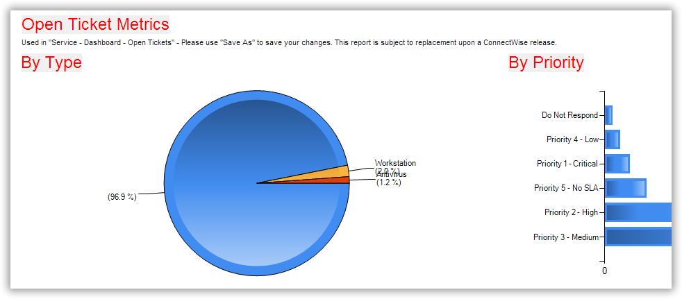
The headers have been modified to be red instead of black.
Add any additional properties to your class or classes, then save your report when you are done.
Note: Some of the report styles are hard coded and cannot be modified with custom CSS from the Style tab. Additionally, some elements of the reports are controlled by nested tags and will require trial and error to identify which classes control specific elements.
Report Viewer Styling
These controls will allow you to control the visual flow of the elements in your report as they appear on the report viewer.
<table data-table-width="760" data-layout="default" ac:local-id="578b09d5-18d7-4ae8-8979-757e0729958b"><colgroup><col style="width: 340.0px;"><col style="width: 340.0px;"></colgroup><tbody><tr><td><p><strong>Feature</strong></p></td><td><p><strong>Description</strong></p></td></tr><tr><td><p></p><p>Minimize Grid Width</p></td><td><p>Adjusts the margins of the data grid to match the size of the data. This can result in columns that are not uniform size.</p></td></tr><tr><td><p></p><p>Visual Group Style</p></td><td><p>Sets how visual groupings will be displayed. This is described in detail below.</p></td></tr></tbody></table> <table data-table-width="760" data-layout="default" ac:local-id="497882d1-aedf-4ab7-a635-320495d11042"><colgroup><col style="width: 340.0px;"><col style="width: 340.0px;"></colgroup><tbody><tr><td><p></p><p>Items Per Page</p></td><td><p>Allows a user to set the number of items shown per page in the report viewer.</p></td></tr><tr><td><p></p><p>Report Order</p></td><td><p>Allows the user to set the order of items included in the report (Summary, Chart, Gauge, Map, Detail). The detail grid is the one created on the Fields tab.</p></td></tr><tr><td><p></p><p>Field|Value Column Pairs</p></td><td><p>Allows the user to set the field value style for multiple columns displaying on one row.</p></td></tr><tr><td><p></p><p>Show Main Report in Field | Value Style</p></td><td><p>Allows a user to set whether the entire detail grid will be shown using the field value style defined above.</p></td></tr><tr><td><p></p><p>Show Summary Report in Field | Value Style</p></td><td><p>Allows a user to set whether the summary grid uses the field value style defined above.</p></td></tr></tbody></table>Visual Group Styles
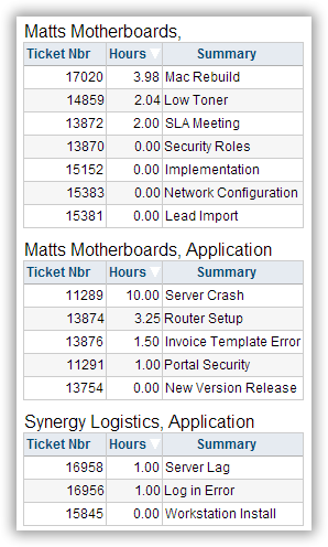
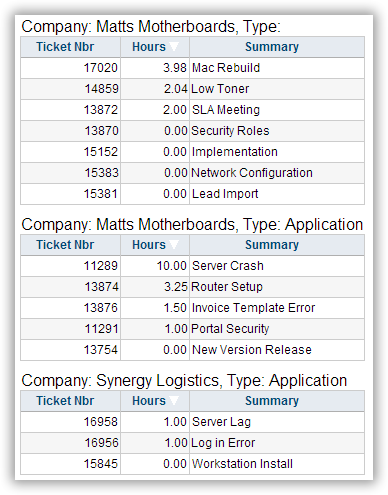
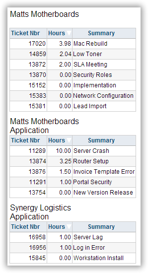
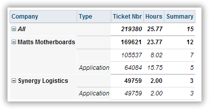
Using visual groups, you can change how reports display grouped data. There are a number of different options to choose from. Most of the styles you can choose from will put the visually grouped fields at the top of the report and the non-grouped fields will then be displayed in a normal grid. Analysis Grid and VG Hierarchy are the exception to this and provide users with more control over what data they are viewing by allowing them to click on the (+)/(-) symbols, which will expand or collapse the container for each level of data. The screenshots below show examples of visually grouped data.
Visually Grouped on Company_Name and Service Type
Comma Delimited
Comma Delimited with Labels
Line Delimited
Analysis
The analysis grid VG style will initially start with every expandable row collapsed. When you click on the (+) next to the value, it will expand that section of the analysis grid and display the data inside. You can have multiple levels nested inside each container, and the Report Writer will automatically calculate the totals for numeric fields inside the non-visual-grouped fields. Below is an example of a 5-level analysis grid.
VG Hierarchy
The VG hierarchy style will create a flat hierarchical representation of the data using the visual group fields as containers, but instead of displaying each level of the hierarchy below the container field's value, it displays it to the right. It also displays all levels expanded by default instead of collapsed by default. You can expand or collapse containers like with the analysis grid.
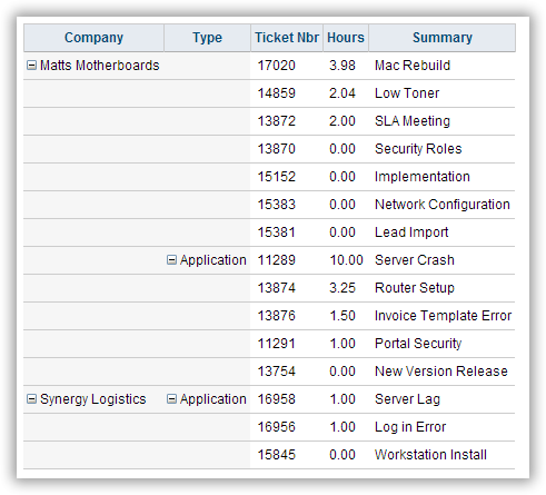
If you attempt to expand a level without also expanding the one before it, nothing will happen. But if you then click the level before it, then all the data within the child level will be expanded as well. If you click the parent level first, then all the child levels will retain the expanded/collapsed state they had when you closed the parent level.