Not yet marked effective — verify this page to set its effective date and review cycle.
Reading tools
Click to enlarge
OverviewOverview
The Charts tab enables you to create a chart using the data in the table or view selected on the Data Sources tab. You can choose from different types of charts, including:
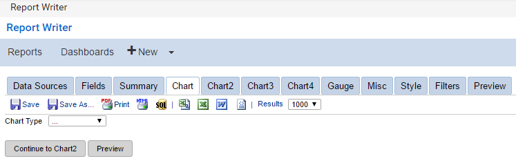
No Selection
Trend
Bar
Pie
Funnel
Visualization
You can have multiple charts in one report or put multiple charts on a dashboard to show key business metrics. The sections below explain each of the chart types and how to use them. The Report Designer enables you to create multiple charts in one report, one per Chart tab.
To locate this screen, navigate to System > Report Writer.
No_Selection_bookmark0No Selection
When the chart type is None (…), no chart appears. If you want to remove a chart from a report, choose this option. This option is selected by default.
Click to enlarge
Trend_bookmark1Trend
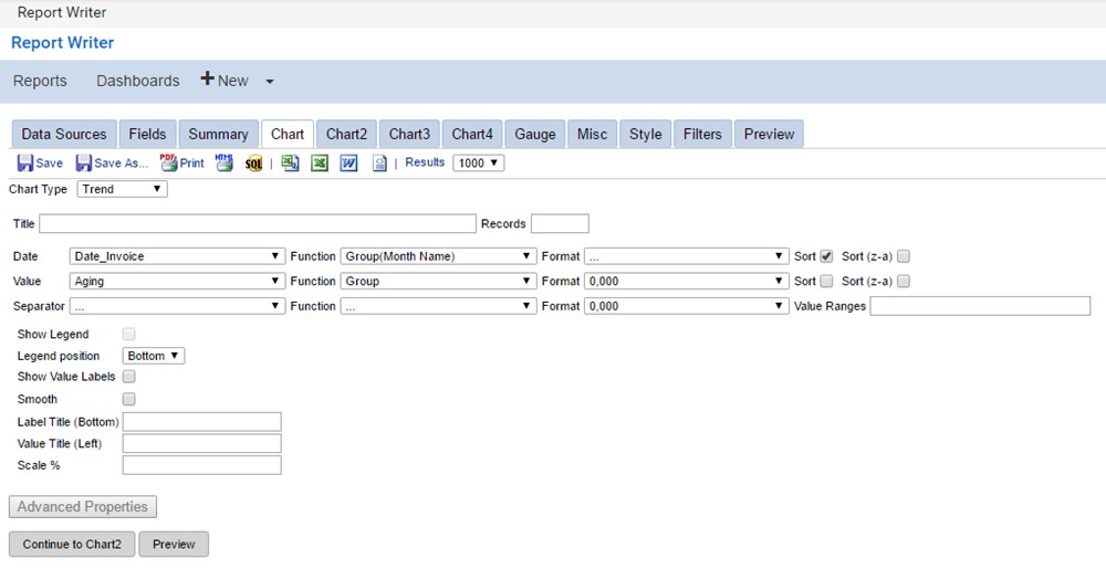
Selecting a Trend chart type will generate a line graph. The table below describes all of the features of the Trend chart type selection.
Click to enlarge
<table data-table-width="760" data-layout="default" ac:local-id="82b7e28d-c569-4916-907c-f6d1bac5da5b"><colgroup><col style="width: 340.0px;"><col style="width: 340.0px;"></colgroup><tbody><tr><td><p>Title</p></td><td><p>Enter a title for the chart. The title appears above the chart.</p></td></tr><tr><td><p>Records</p></td><td><p>Enter the maximum number of records to include in the chart data.</p></td></tr><tr><td><p></p><p>Date</p></td><td><p>Select the time metric for the chart. The options in this field are detected automatically from your selected data sources.</p></td></tr><tr><td><p>Value</p></td><td><p>Select the data metric for the chart. This can be filled with any numeric data.</p></td></tr><tr><td><p>Separator</p></td><td><p>Select the metric that the chart separates data by.</p></td></tr><tr><td><p>Show Legend</p></td><td><p>Displays a color-coded legend below the chart.</p></td></tr><tr><td><p>Legend position</p></td><td><p>Enables you to determine where the legend is placed in reference to the chart.</p></td></tr><tr><td><p>Show Value Labels</p></td><td><p></p><p>Displays the value of the data at each increment mark on the chart.</p></td></tr><tr><td><p>Smooth</p></td><td><p>Displays smooth curves on the trend chart instead of straight lines.</p></td></tr><tr><td><p>Label Title (Bottom)</p></td><td><p></p><p>Enter text for the label that runs across the bottom of the chart.</p></td></tr><tr><td><p>Label Title (Left)</p></td><td><p></p><p>Enter text for the label that runs across the left of the chart.</p></td></tr><tr><td><p>Scale %</p></td><td><p>Enables you to scale your chart to a percentage of the original size.</p></td></tr><tr><td><p>Function</p></td><td><p>Enables you to perform calculations based on the data type.</p></td></tr><tr><td><p>Format</p></td><td><p>Enables you to format the entries of the drop-down menu to the far left.</p></td></tr><tr><td><p>Sort / Sort (z-a)</p></td><td><p>Enables you to sort in ascending or descending order.</p></td></tr><tr><td><p>Value Ranges</p></td><td><p>Enables you to return a defined result based on one or more ranges of the data.</p></td></tr></tbody></table>
Trend_Chart_ModesTrend Chart Modes
There are two modes to select various options from for your trend chart: a simple view and an advanced view. Follow the steps below to create a simple view or advanced view for your trend chart.
Simple View
Select the Chart Type drop-down menu, and choose Trend for the chart type.
Select a field to group the dataset from the Date drop-down menu.
Select a function from the date Function drop-down menu (the function drop-down menu in the date row).
Select the field to be calculated from the Value drop-down menu.
Select a function from the value Function drop-down menu.
Advanced View
Start by completing steps in the Simple View section above, then:
Click the Advanced Properties button.
Select a field to separate data by from the Separator drop-down menu; for example, one line per year.
Select a function that will control how the data will be separated from the separator Function drop-down menu.
Bar_bookmark2Bar
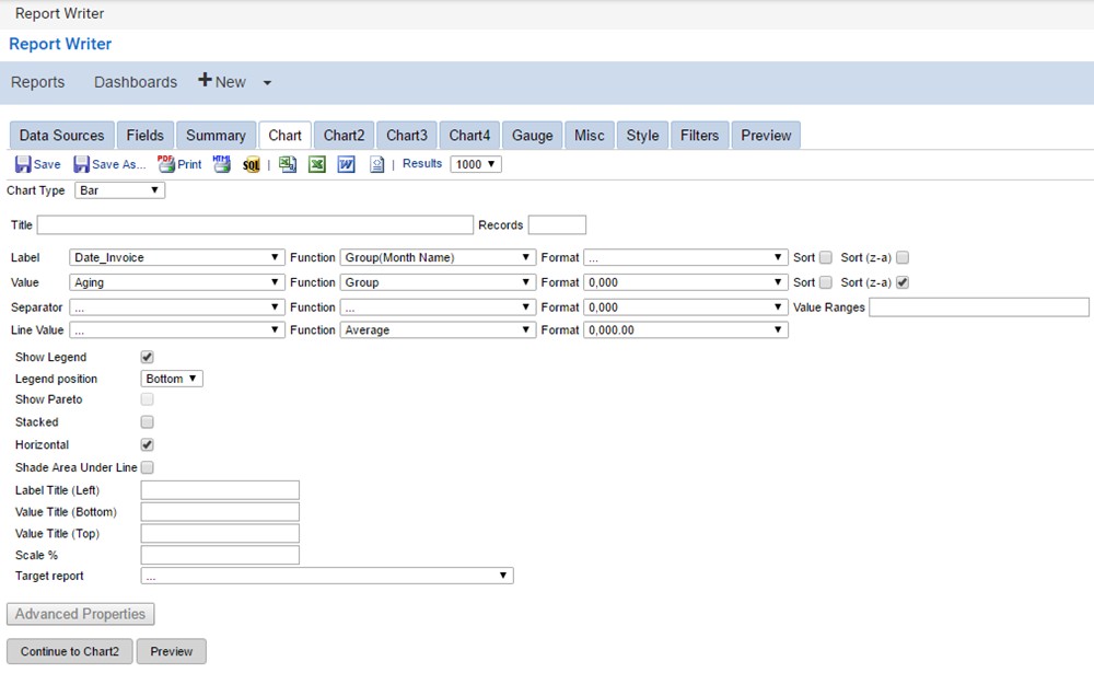
Selecting a Bar chart type will generate a bar chart. The table below describes the features of the Bar chart type selection.
Click to enlarge
<table data-table-width="760" data-layout="default" ac:local-id="713a0497-ec19-4388-9571-a9a283d43a32"><colgroup><col style="width: 340.0px;"><col style="width: 340.0px;"></colgroup><tbody><tr><td><p>Title</p></td><td><p>Enter a title to the chart. It will appear above the chart.</p></td></tr><tr><td><p>Records</p></td><td><p>Enter the maximum number of records to include in the chart data.</p></td></tr><tr><td><p>Label</p></td><td><p>Select a field to use as the x-axis data.</p></td></tr><tr><td><p>Value</p></td><td><p>Select a field to use as the y-axis data.</p></td></tr><tr><td><p>Separator</p></td><td><p>Select a field to separate the data into multiple groups with.</p></td></tr><tr><td><p>Line Value</p></td><td><p>Select an alternate metric to display on the trend line when Show Pareto is selected.</p></td></tr><tr><td><p>Show Legend</p></td><td><p>Display the values supplied with the Separator field as a legend below the chart. The colors for the legend will correspond to the colors shown in the chart.</p></td></tr><tr><td><p>Legend position</p></td><td><p></p><p>Determines where the legend is placed in reference to the chart.</p></td></tr><tr><td><p>Show Pareto</p></td><td><p></p><p>Display a trend chart superimposed upon the bar chart.</p></td></tr></tbody></table>
<table data-table-width="760" data-layout="default" ac:local-id="d1b3a81e-09b2-48f8-a000-8483d3169145"><colgroup><col style="width: 340.0px;"><col style="width: 340.0px;"></colgroup><tbody><tr><td><p></p><p>Stacked</p></td><td><p>Displays the bars as stacked as long as they are in the same grouping (determined by the value of the separator drop-down). Otherwise, they are shown side-by-side.</p></td></tr><tr><td><p></p><p>Horizontal</p></td><td><p>Rotates the bar chart 90 degrees. The bars will animate from left to right. They animate from bottom to top normally.</p></td></tr><tr><td><p>Shade Area Under Line</p></td><td><p></p><p>Displays the entire area underneath the trend line as shaded semi-transparently when Show Pareto is selected.</p></td></tr><tr><td><p>Label Title (Bottom)</p></td><td><p>Enter text for the label that runs across the bottom of the chart, allowing viewers to more easily read the data.</p></td></tr><tr><td><p>Label Title (Left)</p></td><td><p>Enter text for the label that runs across the left of the chart, allowing viewers to more easily read the data. The data displayed in the left margin describes the bar portion.</p></td></tr><tr><td><p>Label Title (Right)</p></td><td><p>Enter text for the label that runs across the right of the chart, allowing viewers to more easily read the data. The data displayed in the right margin describes the trend portion.</p></td></tr><tr><td><p></p><p>Value Ranges</p></td><td><p>Acts as the Advanced menu's Value Ranges item. It will use the specified replacement values for given ranges of data. The number of ranges should correspond to the number of groupings you have in your data.</p></td></tr><tr><td><p>Scale %</p></td><td><p>Scales your chart to a percentage of the original size.</p></td></tr><tr><td><p>Target report</p></td><td><p></p><p>Select a specific subreport to drill-down to. Drill-down reports will open in a new browser tab.</p></td></tr><tr><td><p>Function</p></td><td><p>Performs calculations based on the data type.</p></td></tr><tr><td><p>Format</p></td><td><p>Formats the entries of the drop-down menu to the far left.</p></td></tr><tr><td><p>Sort / Sort (z-a)</p></td><td><p></p><p>Sort entries in ascending or descending order.</p></td></tr><tr><td><p>Value Ranges</p></td><td><p></p><p>Returns a defined result based on one or more ranges of the data.</p></td></tr></tbody></table>
Bar_Chart_ModesBar Chart Modes
There are two modes to select various options from for a bar chart: a simple view and an advanced view. Follow the steps below to create a simple view or advanced view for your bar chart.
Simple View
Select the Chart Type drop-down menu and choose Bar for the chart type.
Enter a name for your chart in the Title text menu.
Select a field to group the dataset from the Label drop-down menu.
Select a function from the label Function drop-down menu.
Select a field to be calculated from the Value drop-down menu.
Select a function from the value Function drop-down menu.
Advanced View
Start by completing steps in the Simple View section above, then:
Click the Advanced Properties button.
Select the field to separate the data by in the Separator drop-down menu.
Select the function that will control how the data will be separated from the separator Function drop-down menu.
Select a field from the Line Value drop-down menu.
Select a function for your line value from the line value Function drop-down menu.
Optionally, enter text in the Label Title (Bottom), Value Title (Left), and Value Title (Right) fields.
Pie_bookmark3Pie
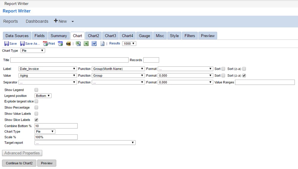
Selecting a Pie chart type will generate a pie chart. The table below describes all of the features of the Pie chart type selection.
Click to enlarge
<table data-table-width="760" data-layout="default" ac:local-id="415179b1-04d2-4b37-8938-40447d2a378e"><colgroup><col style="width: 340.0px;"><col style="width: 340.0px;"></colgroup><tbody><tr><td><p>Title</p></td><td><p>Enter a title to the chart. It will appear above the chart.</p></td></tr><tr><td><p>Records</p></td><td><p>Enter the maximum number of records to include in the chart data.</p></td></tr><tr><td><p></p><p>Label</p></td><td><p>Select the field used for the label of each slice of the pie. The options in this field are detected automatically from your selected data sources.</p></td></tr><tr><td><p>Value</p></td><td><p>Select the data metric for the chart. This can be filled with any numeric data.</p></td></tr><tr><td><p>Separator</p></td><td><p>Separates data into multiple charts based on a field value.</p></td></tr><tr><td><p>Show Legend</p></td><td><p></p><p>Displays a color-coded legend below the chart.</p></td></tr><tr><td><p>Legend position</p></td><td><p></p><p>Determines where the legend is placed in reference to the chart.</p></td></tr><tr><td><p>Explode largest slice</p></td><td><p></p><p>Displays the piece with the highest percentage separate from the rest of the pie.</p></td></tr><tr><td><p>Show Percentage</p></td><td><p></p><p>Displays the percentage of the pie each section represents.</p></td></tr></tbody></table>
<table data-table-width="760" data-layout="default" ac:local-id="e34e7022-e6bf-4c39-8145-d5e7f332e6f2"><colgroup><col style="width: 340.0px;"><col style="width: 340.0px;"></colgroup><tbody><tr><td><p>Show Value Labels</p></td><td><p></p><p>Displays the numeric value of each slice.</p></td></tr><tr><td><p>Show Slice Labels</p></td><td><p></p><p>Displays the text value of each slice.</p></td></tr><tr><td><p>Combine Bottom %</p></td><td><p>Combines the entries with the smallest percentages until it meets or exceeds the given amount. Entered as a percentage of a whole number (e.g., an input value of 10 = 10%).</p></td></tr><tr><td><p>Chart Type</p></td><td><p>Select whether the chart will be a pie or a doughnut.</p></td></tr><tr><td><p></p><p>Scale %</p></td><td><p>Enter the percentage to scale the chart to. Entering 100% will yield the same result as putting nothing here.</p></td></tr><tr><td><p>Target report</p></td><td><p></p><p>Select a specific subreport to drill-down to. Drill-down reports will open in a new browser tab.</p></td></tr><tr><td><p>Function</p></td><td><p>Performs calculations based on the data type.</p></td></tr><tr><td><p>Format</p></td><td><p>Formats the entries of the drop-down menu to the far left.</p></td></tr><tr><td><p>Sort / Sort (z-a)</p></td><td><p></p><p>Sorts entries in ascending or descending order.</p></td></tr><tr><td><p>Value Ranges</p></td><td><p></p><p>Returns a defined result based on one or more ranges of the data.</p></td></tr></tbody></table>
Pie_Chart_ModesPie Chart Modes
There are two modes to select various options from for a pie chart: a simple view and an advanced view. Follow the steps below to create a simple view or advanced view for your pie chart.
Simple View
Select the Chart Type drop down menu and choose Pie for the chart type.
Enter a name for your chart in the Title text menu.
Select a field to group the dataset from the Label drop-down menu.
Select a function from the label Function drop-down menu.
Select the field to be calculated from the Value drop-down menu.
Select a function from the value Function drop-down menu.
Advanced View
Start by completing steps in the Simple View section above, then:
Click the Advanced Properties button.
Select the field to separate the data by in the Separator drop-down menu.
Select the function that will control how the data will be separated from the the separator Function drop- down menu.
Select Pie or Doughnut from the Chart Type drop-down menu.
How_to_Create_a_Bar_and_Pie_ChartHow to Create a Bar and Pie Chart
Watch the following video to learn how to create a bar chart and pie chart for your report.
Media, iframe, embed and object tags are not supported inside of a PDF.
Funnel_bookmark4Funnel
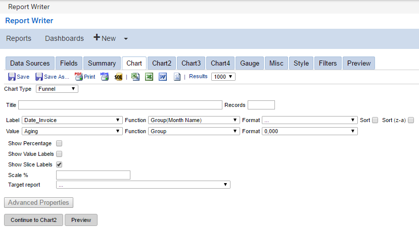
Selecting a Funnel chart type will generate a funnel chart. This can be useful for identifying gaps in your organization's sales process. The table below describes the features of the Funnel chart type selection.
Click to enlarge
<table data-table-width="760" data-layout="default" ac:local-id="866d743a-1ef9-48c9-b375-2ab127e4c149"><colgroup><col style="width: 340.0px;"><col style="width: 340.0px;"></colgroup><tbody><tr><td><p>Title</p></td><td><p>Enter a title to the chart. The title appears above the chart.</p></td></tr><tr><td><p>Records</p></td><td><p>Enter the maximum number of records to include in the chart data.</p></td></tr><tr><td><p>Label</p></td><td><p>Select a field to use as the x-axis data.</p></td></tr><tr><td><p>Value</p></td><td><p>Select the data metric for the chart. This can be filled with any numeric data.</p></td></tr><tr><td><p>Show Percentage</p></td><td><p>Displays the percentage of the funnel each section represents.</p></td></tr><tr><td><p>Show Value Labels</p></td><td><p>Displays the numeric value of each slice.</p></td></tr><tr><td><p>Show Slice Labels</p></td><td><p>Displays the text value of each slice.</p></td></tr><tr><td><p>Scale %</p></td><td><p>Scales your chart to a percentage of the original size.</p></td></tr><tr><td><p>Target Report</p></td><td><p>Select a specific subreport to drill-down into.</p></td></tr><tr><td><p>Function</p></td><td><p>Performs calculations based on the data type.</p></td></tr><tr><td><p>Format</p></td><td><p>Formats the entries of the drop-down menu to the far left.</p></td></tr><tr><td><p>Sort / Sort (z-a)</p></td><td><p>Sorts entries in ascending or descending order.</p></td></tr></tbody></table>
Funnel_Chart_ModesFunnel Chart Modes
There are two modes to select various options from for a funnel chart: a simple view and an advanced view. Follow the steps below to create a simple view or advanced view for your funnel chart.
Simple_ViewSimple View
Click the Chart Type drop-down menu and choose Funnel for the chart type.
Enter a name for your chart in the Title text menu.
Select a field to group the dataset from the Label drop-down menu.
Select a function from the label Function drop-down menu.
Select the field to be calculated from the Value drop-down menu.
Select a function from the value Function drop-down menu.
Advanced_ViewAdvanced View
Start by completing steps in the Simple View section above, then:
Click the Advanced Properties button.
Select the Show Percentage checkbox if you want to show the percentage of the funnel each section represents.
Enter a value in the Scale % field if you want to scale your chart to a percentage of the original size.
Select a report from the Target Report drop-down menu if you want to specify a subreport to drill-down into.
Visualization__bookmark5Visualization
Visualizations are a dynamic framework for advanced reporting that enable you to use more than a dozen powerful, animated, interactive charts, graphs, and more. You can display and comprehend your data in a completely new way with visualizations. Visualizations can be used in a single report or combined with other types of visualizations, reports, and forms into a dashboard